Talbott & Arding
Brand Identity, Photography Art Direction, Product Style Guide, Art Direction, Packaging
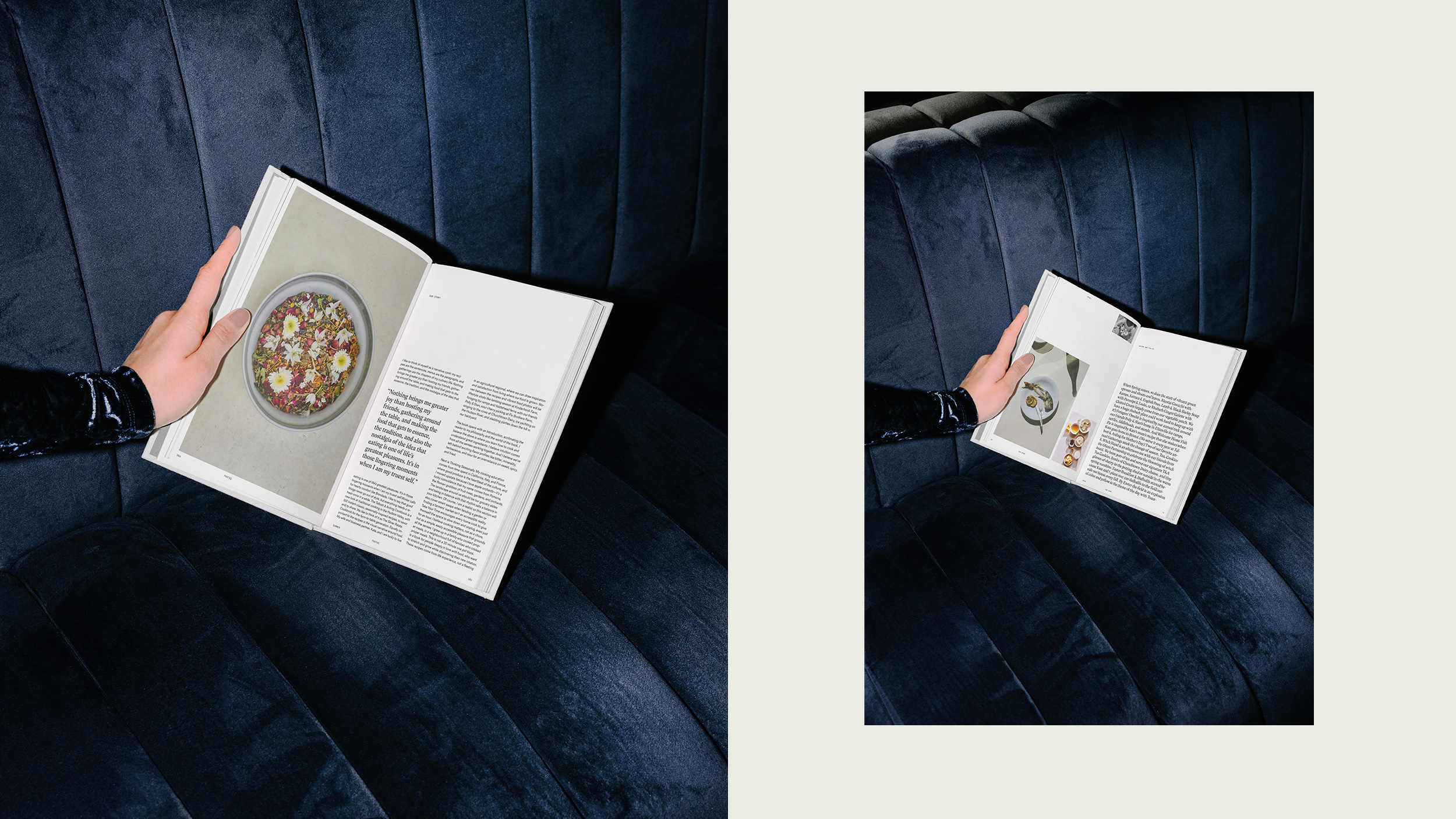
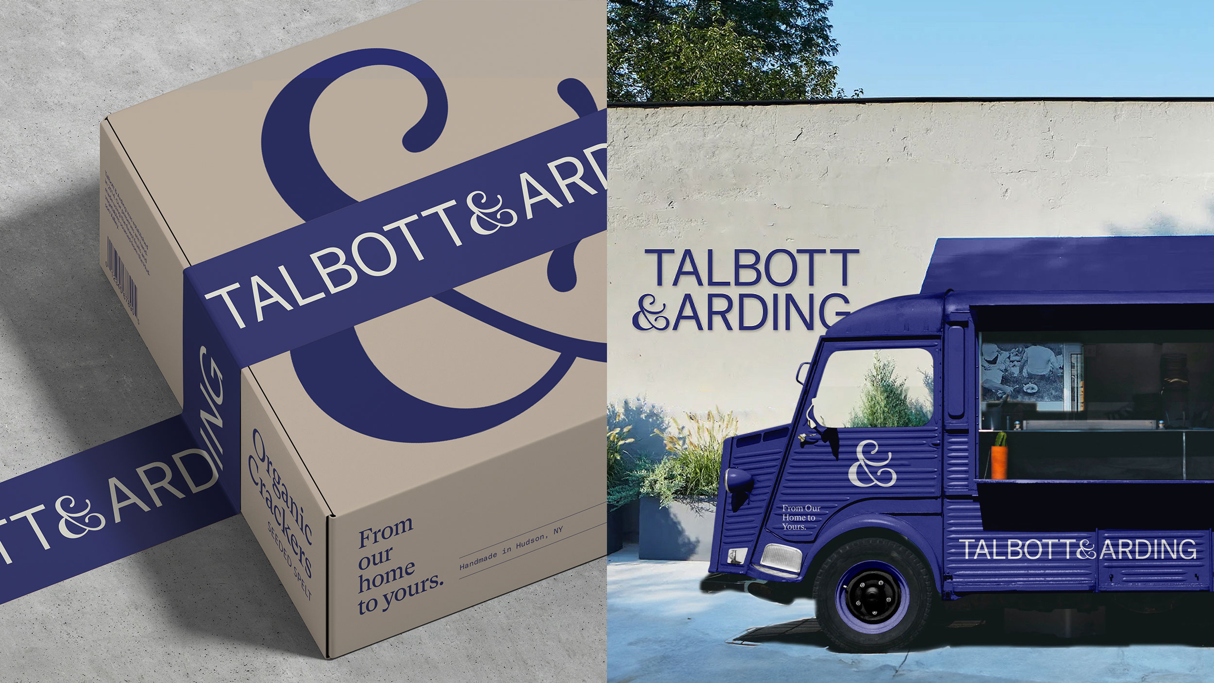
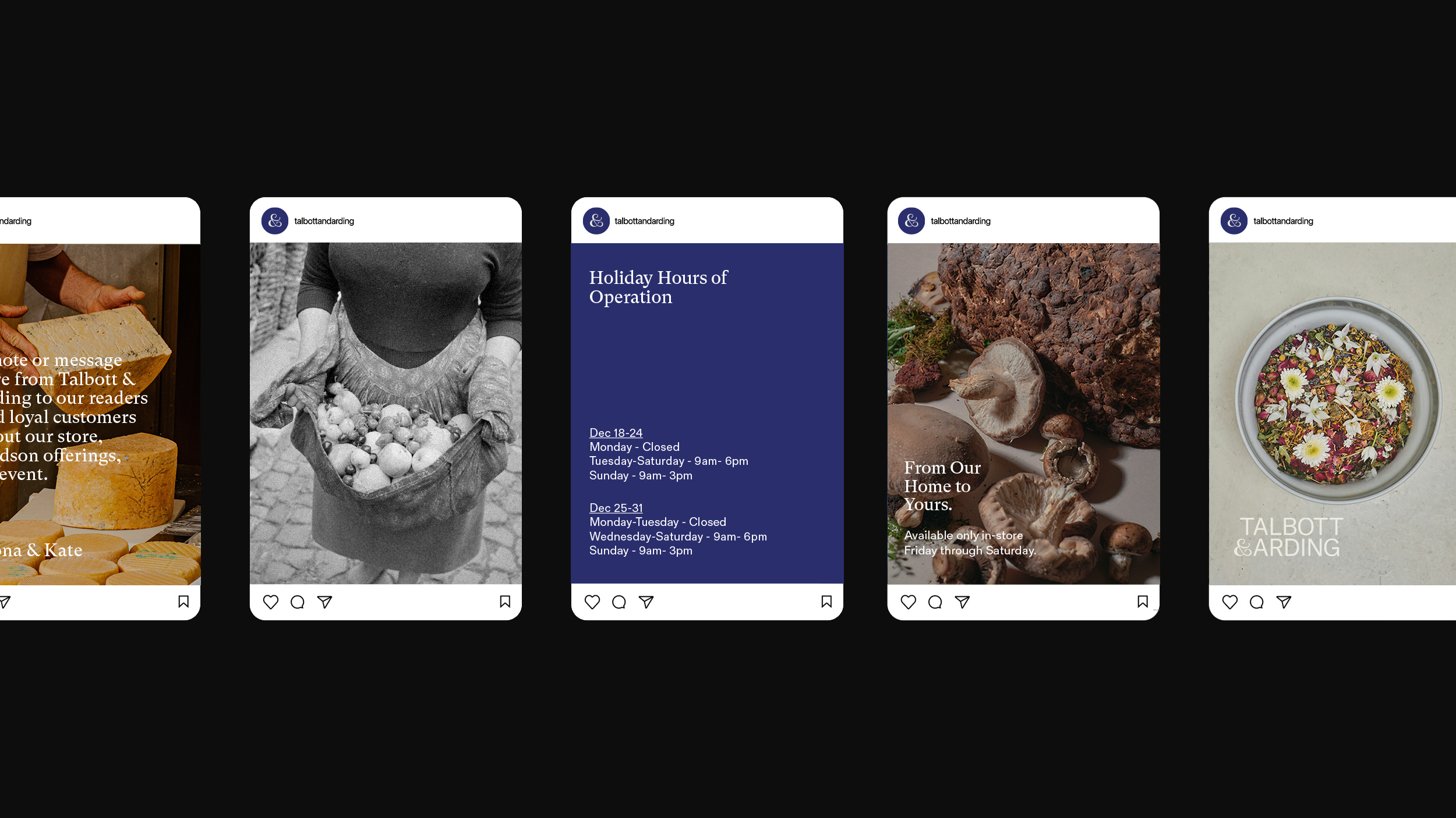
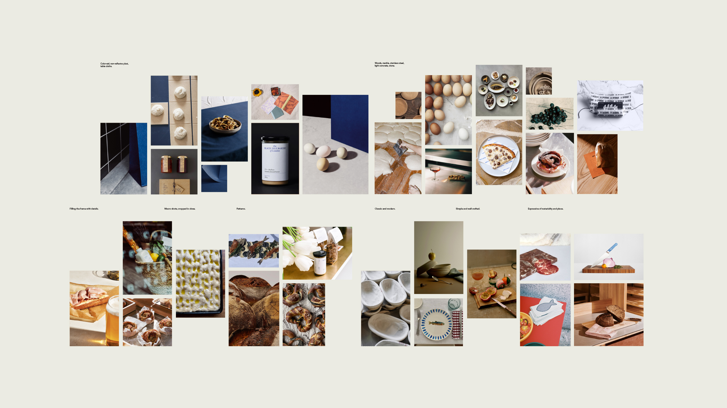
Visual identity package for Talbott & Arding, a cheese and provisions shop located in Hudson, NY. The work includes a custom Wordmark and Ampersand system, conceptual cookbook design, a comprehensive Product Photography Style Guide, Art Direction for video and packaging and a custom mix for the space.
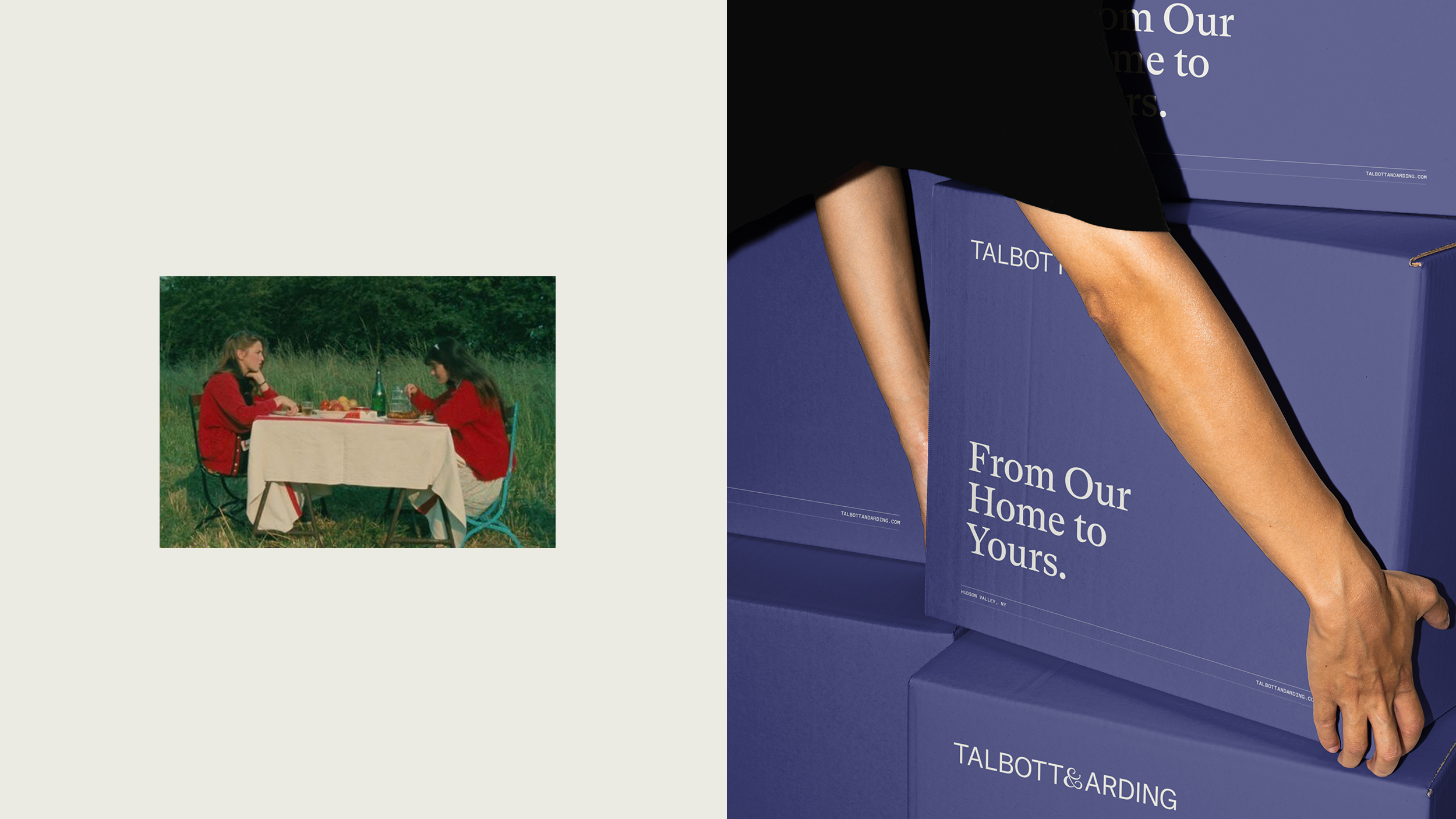
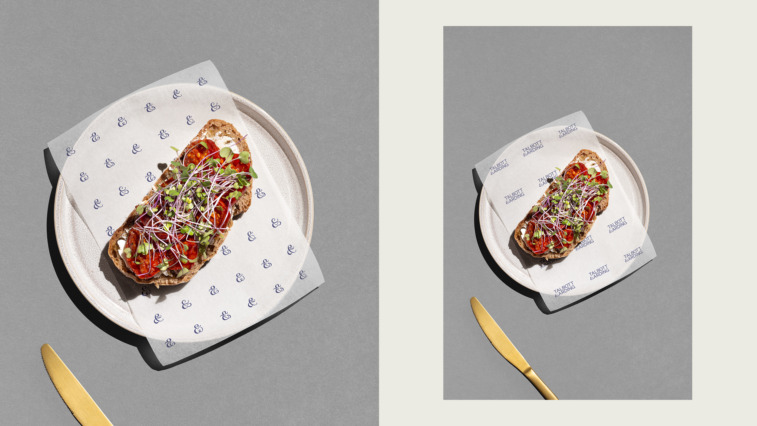
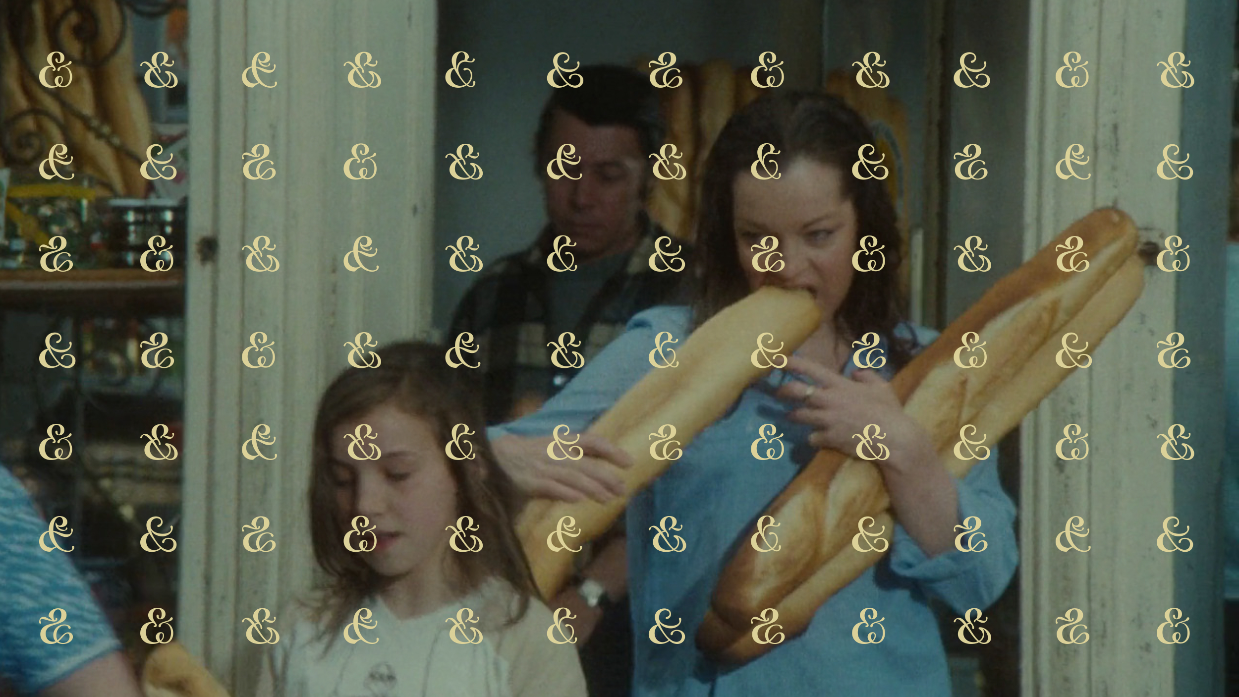
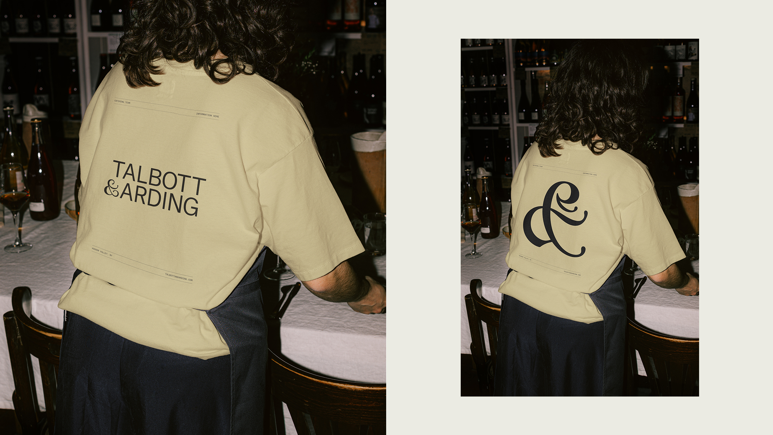
The brand identity for Talbott & Arding is inspired both by the collaborative craftsmanship of the Hudson Valley as well as the myriad of offerings at Talbott & Arding. Each ampersand corresponds to an aspect of the in-store and online experience. For Talbott & Arding, the Hudson Valley is where food, ideas and creativity thrive, and it is here where the brand has established a community of farmers and makers who share its commitment to things that taste like the places they’re from. The strategic use of a flexible ampersand system grounding the brand together is representative of this commitment to collaboration with craftsmen and farmers that Talbott & Arding have, as well as the combining of visions of the two founders, Mona Talbott and Kate Arding.
Featured on It’s Nice That.
Project lead: Jorge Pardo
Design support: Vivian Dehning
Brand Strategy: Rebecca Van de Sande