Uptake
Brand Identity, Design Direction for Website
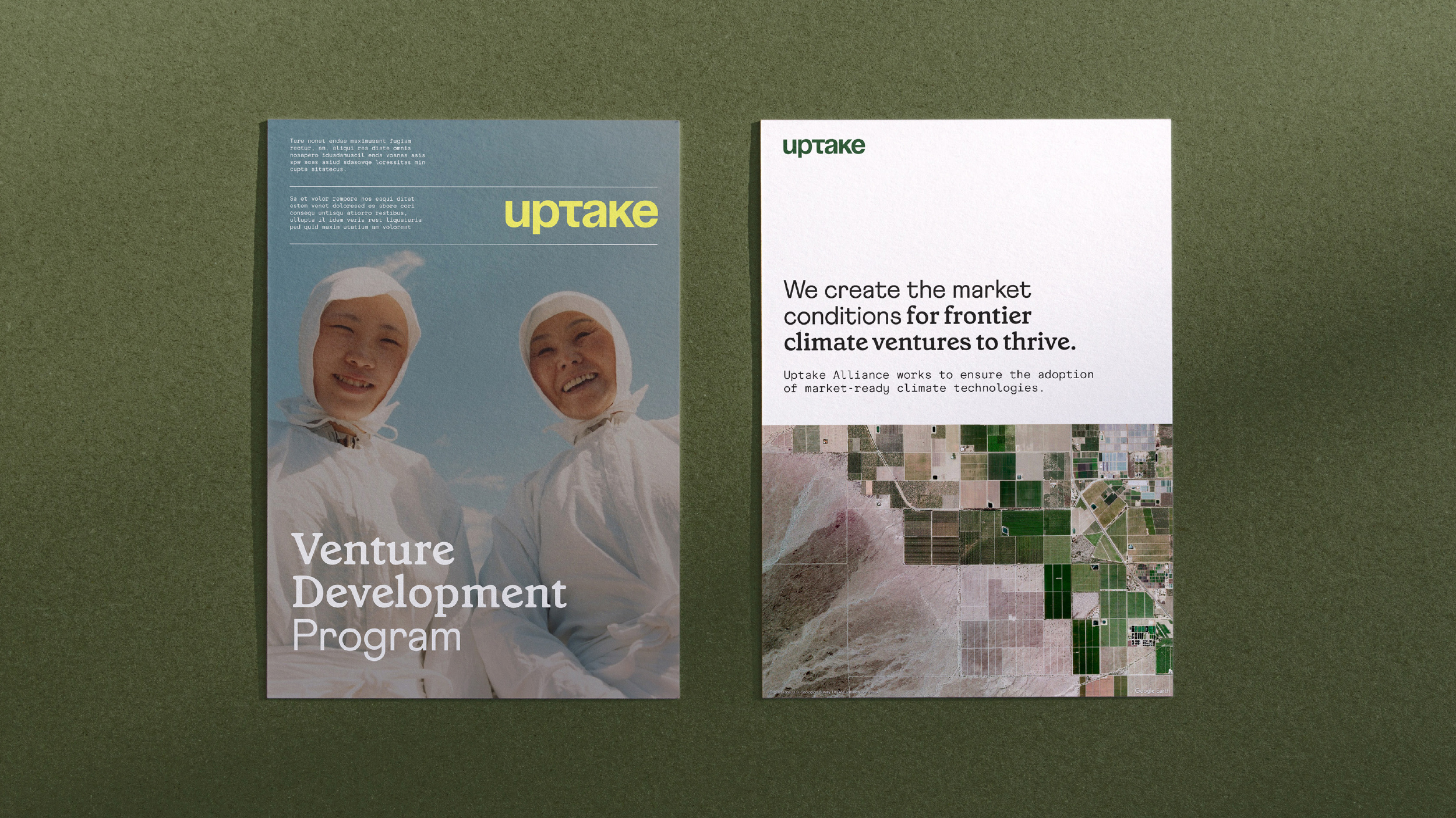
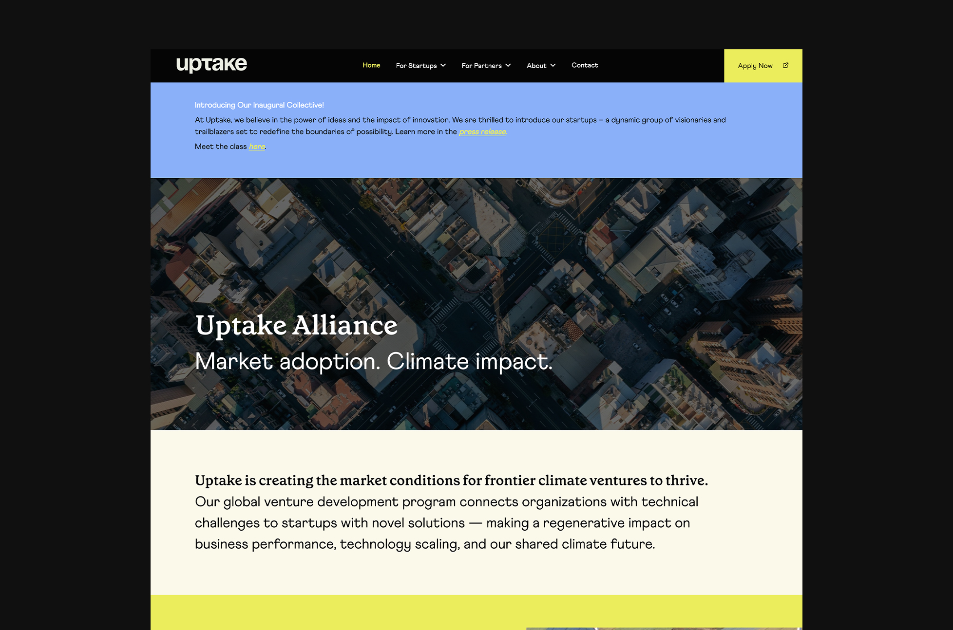
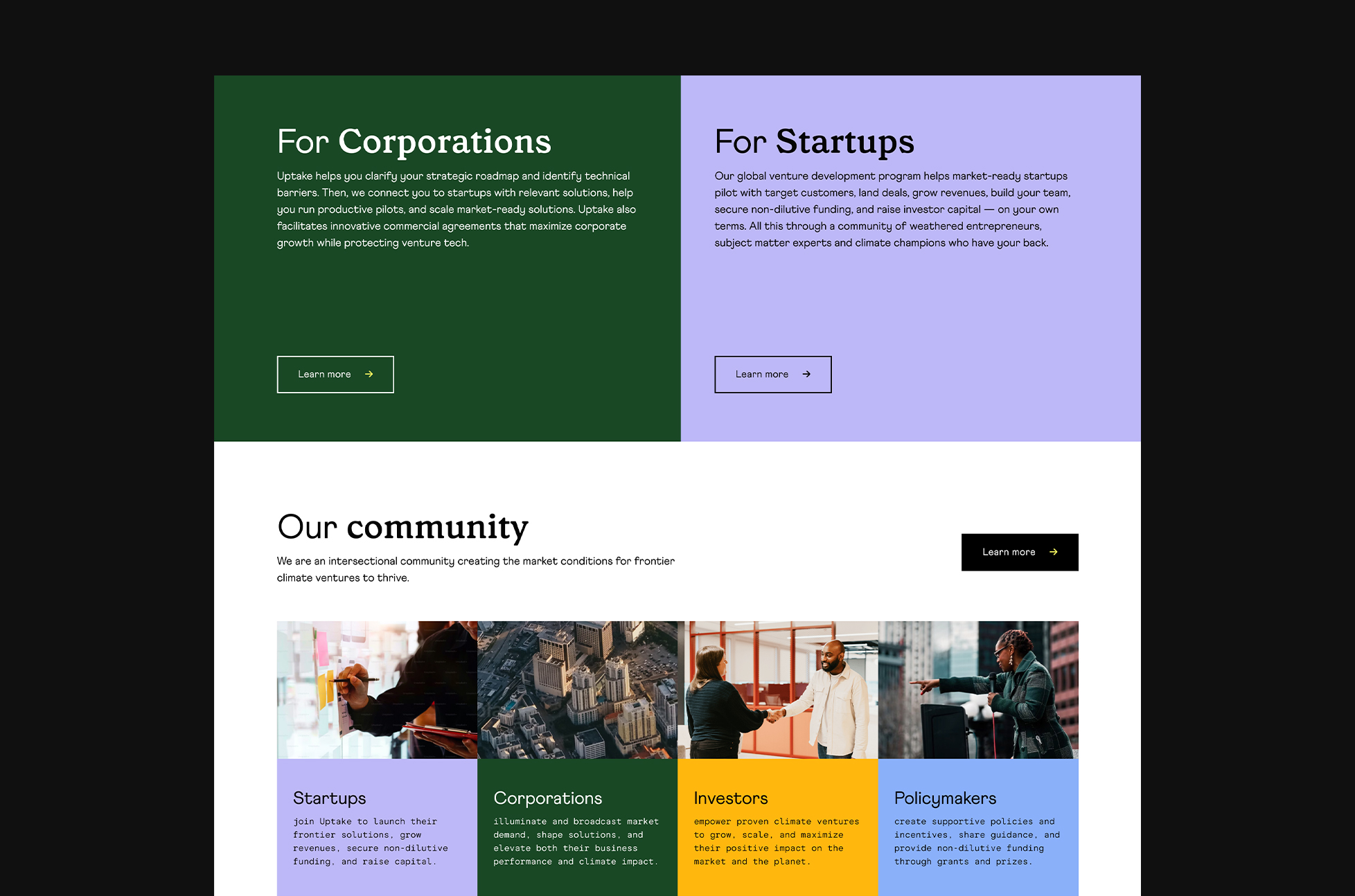
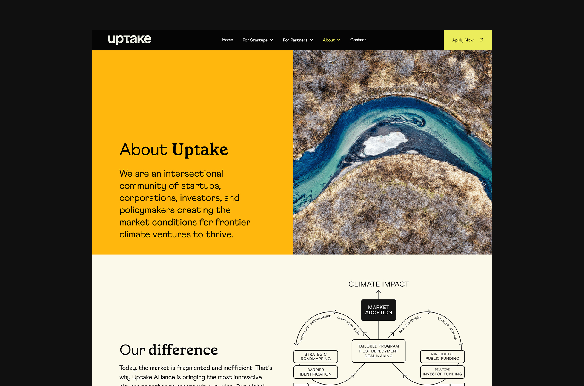
Visual identity and design direction for Uptake Alliance. Uptake is creating the market conditions for frontier climate ventures to thrive. Their global venture development program connects organizations with technical challenges to startups with novel solutions — making a regenerative impact on business performance, technology scaling, and our shared climate future.
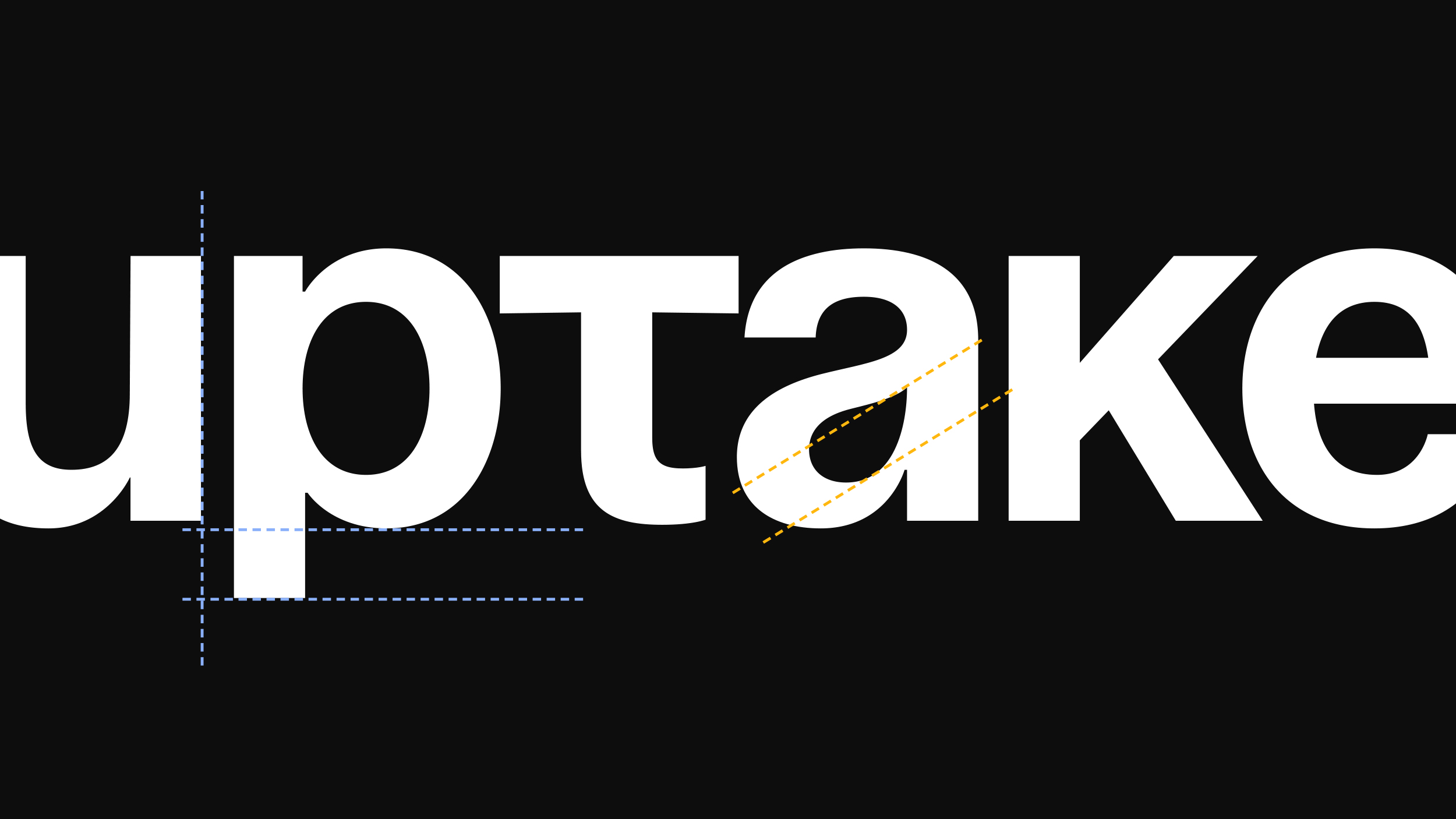
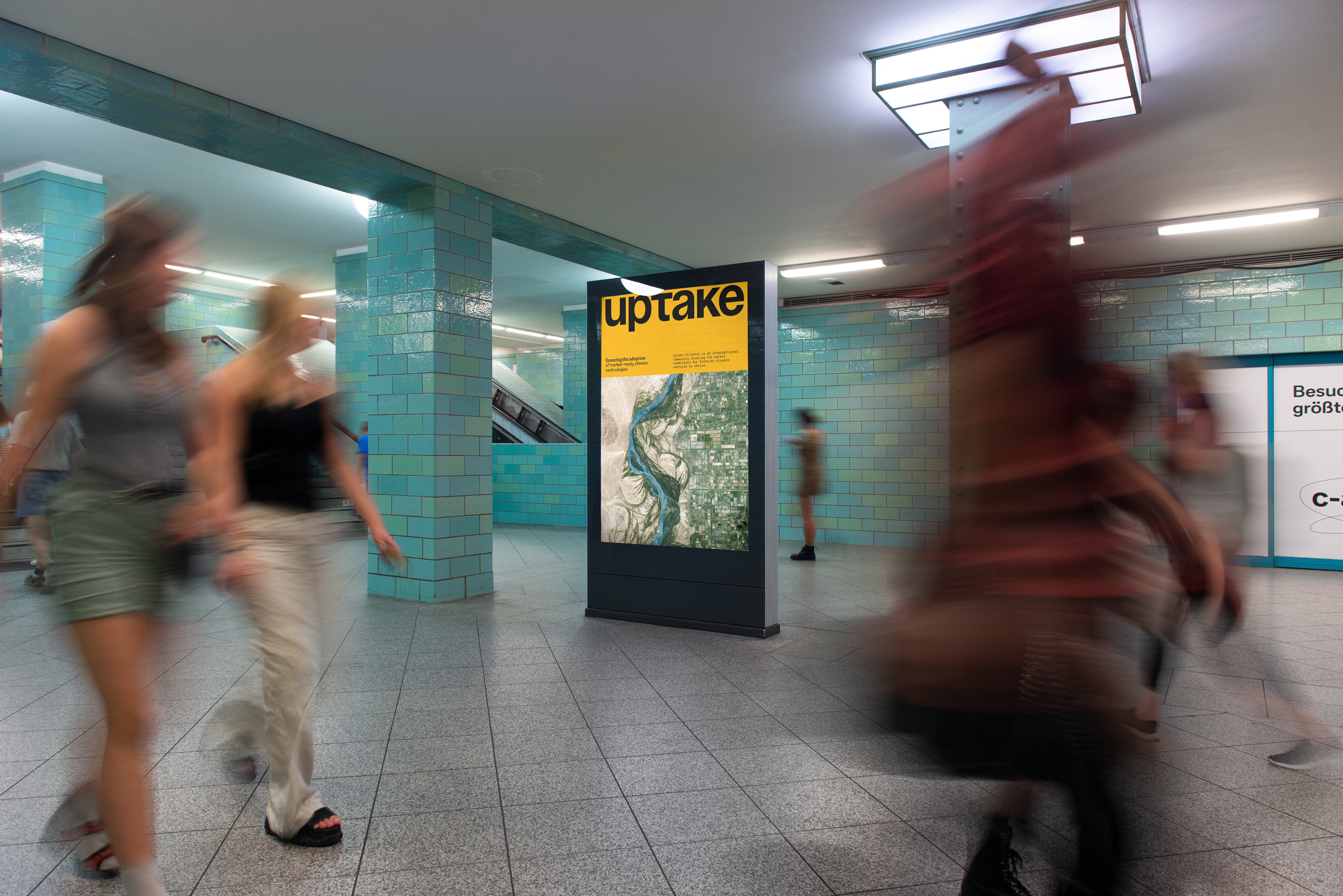
The wordmark is customized with an adjusted T so that the letterforms feel balanced with each other, all aligning with the same x-height. This creates a feeling of compressed energy on the verge of take-off — uptake. The descender (bottom) of the p is shortened as well, giving the mark a distinct geometric shape. The unified letterforms also create a sense of alliance for the brand.
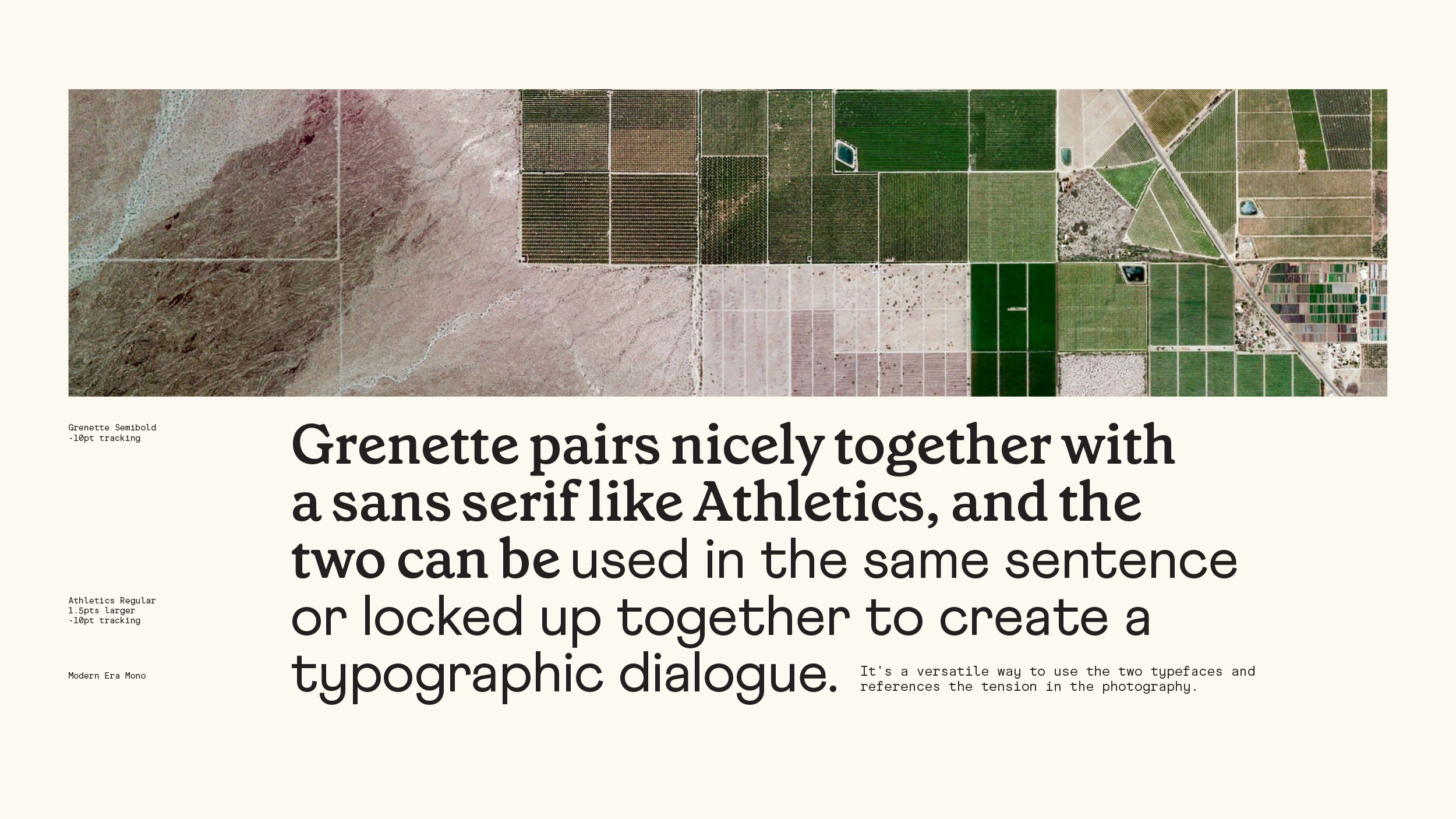
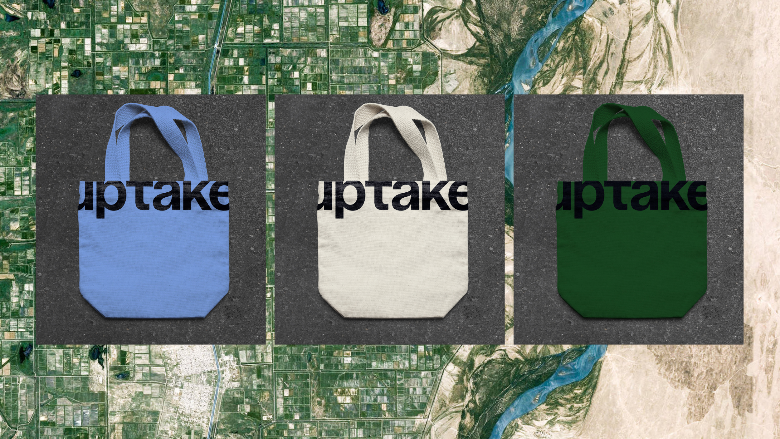
A set of vibrant colors bring a contemporary sense to the brand, especially when paired with powerful landscape and aerial photography.
The identity is crisp and and unruly, brimming with energy.
https://www.uptakealliance.com/





Created with Ume Design